The last project in my typography class this semester involves designing a greeting card. If you're interested, you can see the full instructions here.
Client
Me. I'm looking for an interesting card to send to friends and family and maybe even people who refer clients my way. The designer can have free reign on the design. Whatever she likes, I'm sure I'll like too.
Research
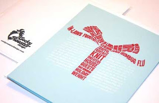
I started by searching online for cards that I liked. I was surprised at how difficult it was to find cards that just used type rather than type and image. I did find some wonderful examples, though. Etsy actually has some beautiful handmade cards and stationery. I'd love to be able to make a letter press card. Unfortunately, I don't have the equipment so Adobe Illustrator will have to do. I went to Promenade and Art Mart because they often have interesting cards but I found nothing in terms of typography cards. Here are some cards from the web that I particularly liked:
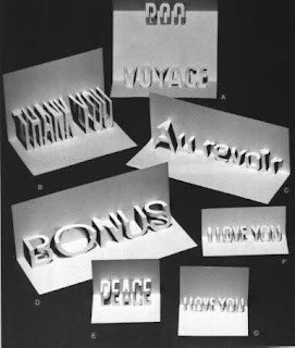
I'm hoping to incorporate this cutout design. The card itself doesn't do much for me but this was a good example of what might work for numbers of the new year. When I was a kid, I really loved pop-up books. Not sure why. I just thought it was so cool that the book was 3-D and that little pieces would sort of jump off the page.
Clever use of words to create images:
The 12 Days of Christmas cards below are just plain clever. I don't think I could ever be a copywriter because I can't seem to come up with such clever ways to use words. Occasionally, I'll hit on something cool but usually, I just come up with something goofy and dorky!
I included this girlfriends card because my girlfriends are my lifesavers and also because I thought the use of typography was interesting.
The 2010 card has an interesting texture -- looks like woven textile.
I did some more specific research on pop-up or cut out cards so I can figure out if I want to incorporate something like that. The first is from a "maths and art" page and was made by a mathematician as part of his work with Maths and Arts club in York, Ontario. Painting the cut out part red, makes it stand out a lot more...good idea.
Some more cards with letter cut outs along with instructions:
Finally, a nice set of cut out wings:
 Speaking of which -- it's late and I gotta fly.
My sister Sarah (sounds like the name of a rock band), who is a Graphic Designer, sent me a link to the Poetry Foundation which has some really great photos of type treatments. These photos led me to Poetry in the Landscape a flickr page which contains photos of the projected word poetry. Like this
and this
From there, I clicked on over to the Winterhouse flickr page. Winterhouse looks like an interesting organization with very relevant links to socially responsible and forward looking design as well as other great organizations, publications, etc.
Their flickr page has images of Poetry magazine covers. I was captivated by these covers. The artwork conveys various moods across issues -- some calm (these are the ones that draw me the most)
and some energetic.
To my eye, Winterhouse has designed a beautifully poetic layout. The cover is culled down to essentials. As with poetry, the elements on the page seem to be chosen carefully with plentiful white space to "hold" the components. Picture a poem on the page.
Because I was trolling for possible typography posts, I especially noticed the masthead and thought it was a perfect match for the magazine. I tried to identify the font (so that I could dutifully name it in my post) and was able to almost get it except that I couldn't find an R that looked like the one in the masthead. So...being the brash, pushy woman I am, I just emailed the magazine and asked what font it was.
I was surprised to very promptly receive an email from none other than Fred Sasaki, an Associate Editor of Poetry. Here's the info he generously provided (links are mine):
The Poetry logo font is Gill Sans (however you'll see that the "R" is modified for the cover). Interior text is Pietro, which is a modified Bembo.
Interestingly, the Pegasus we are currently using (which the magazine used back in the forties or so) is an Eric Gill design, the typographer who created Gill Sans and contributed a great deal to modern typography.
I felt rather proud of myself for noting that the R was unique. What is really confusing me is that when I looked up the Pegasus font he notes in his email, fonts.com features it as a free font but it's an exact replica of ITC Benguiat of which I made the poster for class.
At any rate, this is some of what we're learning in class come to life!
Erik Spiekermann put together this little typographic image and I just really like it.


