Tuesday, December 8, 2009

Gunter Rambow

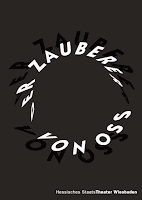
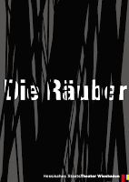
Discovered this designer in Graphic Design history. Love his work! Here are some posters he did for a Theater in Wiesbaden, Germany. There are lots and lots of images on his website -- really interesting design. 

I think these two are my favorites. They kinda hurt my eyes but I love the intricacies of them. If you look at the "Love Counts" poster, you can see the use of numbers (clever!) to create the image. You can also see the theater name in one of the lines toward the bottom but you have to work for it. They're mostly in German so I don't know what half of them say.


I've tried to identify these fonts but I give up. There's always one little thing off. It's also possible that since the designer is German (Austrian?) he's using different fonts than what I can find. They're all sans serif and pretty classic, though. The font itself seems less important than the way he uses it.


He seems to like a black, white, gray, red palette.  He also likes to use type in curves.


Many of his designs for the theater are type-focused. He's really able to use type and some imagery to capture attention in a simple way.


Some of his designs get a little "messy" too, though.


Monday, December 7, 2009

Things Made up of Things


I found this in an ad placed in American Craft magazine. I really liked the treatment of the S. It's a gallery that represents glass artists. I'm not sure I fully understand the definition of silica (or silicone in the singular) but I think it's one of the contents of glass. The S is a larger curved thing made of smaller curved things. This could refer to both glass (a substance made up of a number of other substances) or to several artists making up the gallery. The color actually looks nicer in the ad than it does reproduced here. 

Wednesday, December 2, 2009

Fragments


This is a wall hanging that was pictured in an American Craft magazine (vol. 69, no. 3, Jun/July 2009). It was designed by Paul Loebach & Jessie Henson. I couldn't get the dimensions on it but it was hanging in one of the spreads and looks like it must be about 3' X 5'. The type treatment is interesting. I like the hand lettered look. Seems to match the sentiment. 

I was interested in the saying so I looked it up and found that it comes from a Bible verse (John 6:12). After a meal, Jesus, tells his disciples to "gather up the fragments that remain that nothing will be lost." Good sentiment for today -- don't waste the leftovers! Wish I could afford the wall hanging for my dining room.